What you receive
A brand direction, colour and type system, and the logo files and applications included in your proposal. A usage guide keeps the identity consistent.
Branding starts with what a business wants to say and how it wants to be perceived. We connect the name, symbol, colours and voice, then test the identity across web, social and print.
A brand direction, colour and type system, and the logo files and applications included in your proposal. A usage guide keeps the identity consistent.
Your business name, audience, services, references you like and existing materials. We agree what to preserve and what can change.
Define the message and character, approve a visual direction and develop the selected applications. Final files are prepared for the agreed uses.
Examples that show the journey from idea to outcome. One control to play, pause and resume.
A quiet identity for an architecture studio: a linear mark, deep green and stone tones. The card and brand materials leave space for photography and projects.
Line
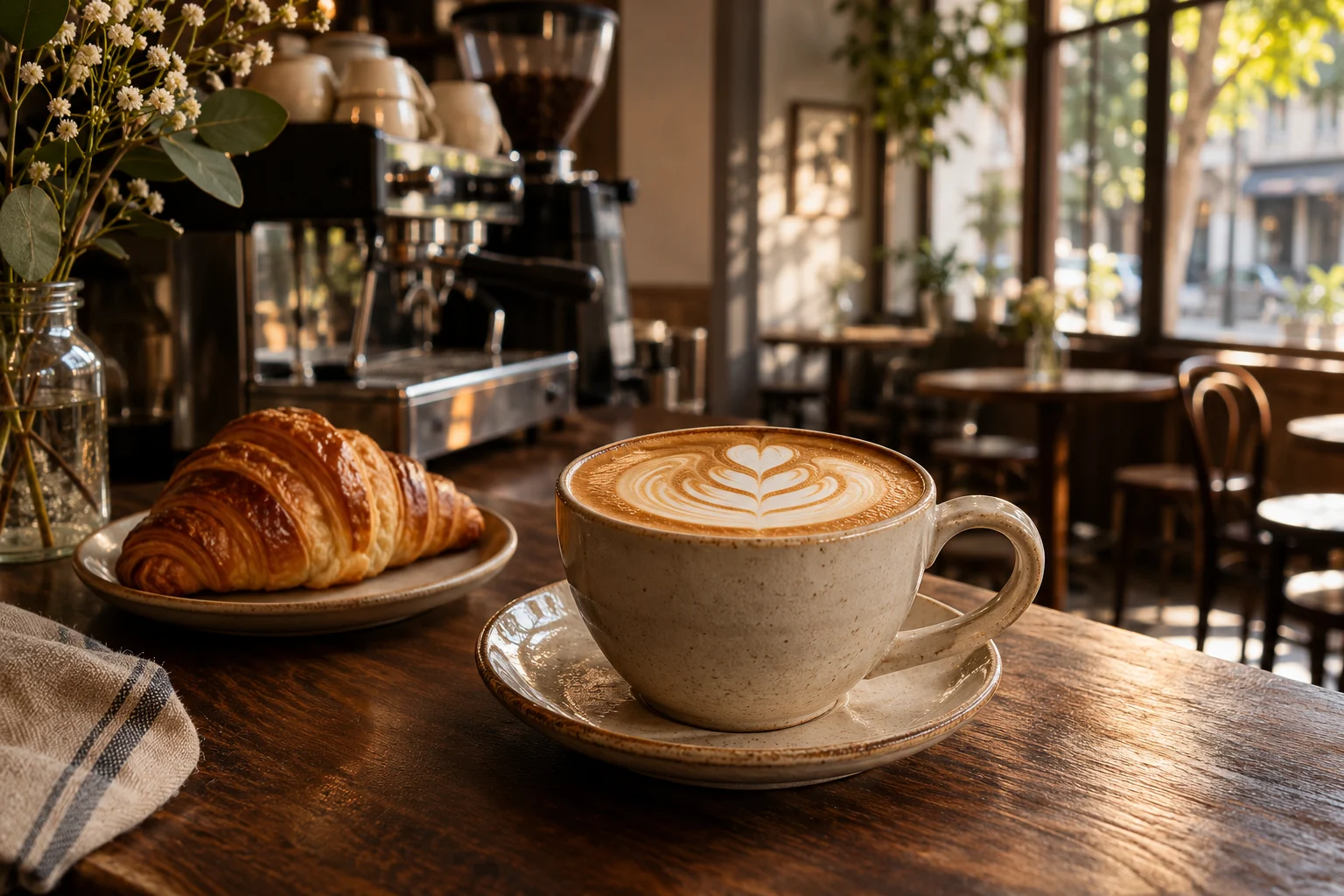
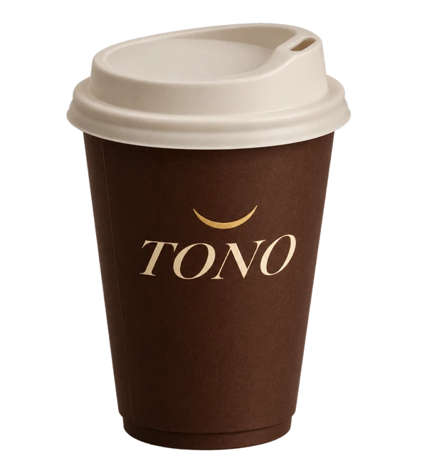
Warm colours and soft lettering give the café a welcoming character. Cups and promotional materials share a visual language people can recognise beyond the café.
Palette
A bold purple and lime contrast gives a creative brand its character. The mark, lettering and poster show how the identity carries across formats.
Card
Start with a need, choose the services and define a process that fits.